UI & UX Design
Behavioral design is at the heart of every UX project that I take on. I focus on turning everyday interactions into meaningful experiences where every click has intention and every design choice drives engagement. When behavior is thoughtfully integrated into UX, it goes beyond just functionality, it builds trust, strengthens user connection, and makes people feel genuinely seen and understood.
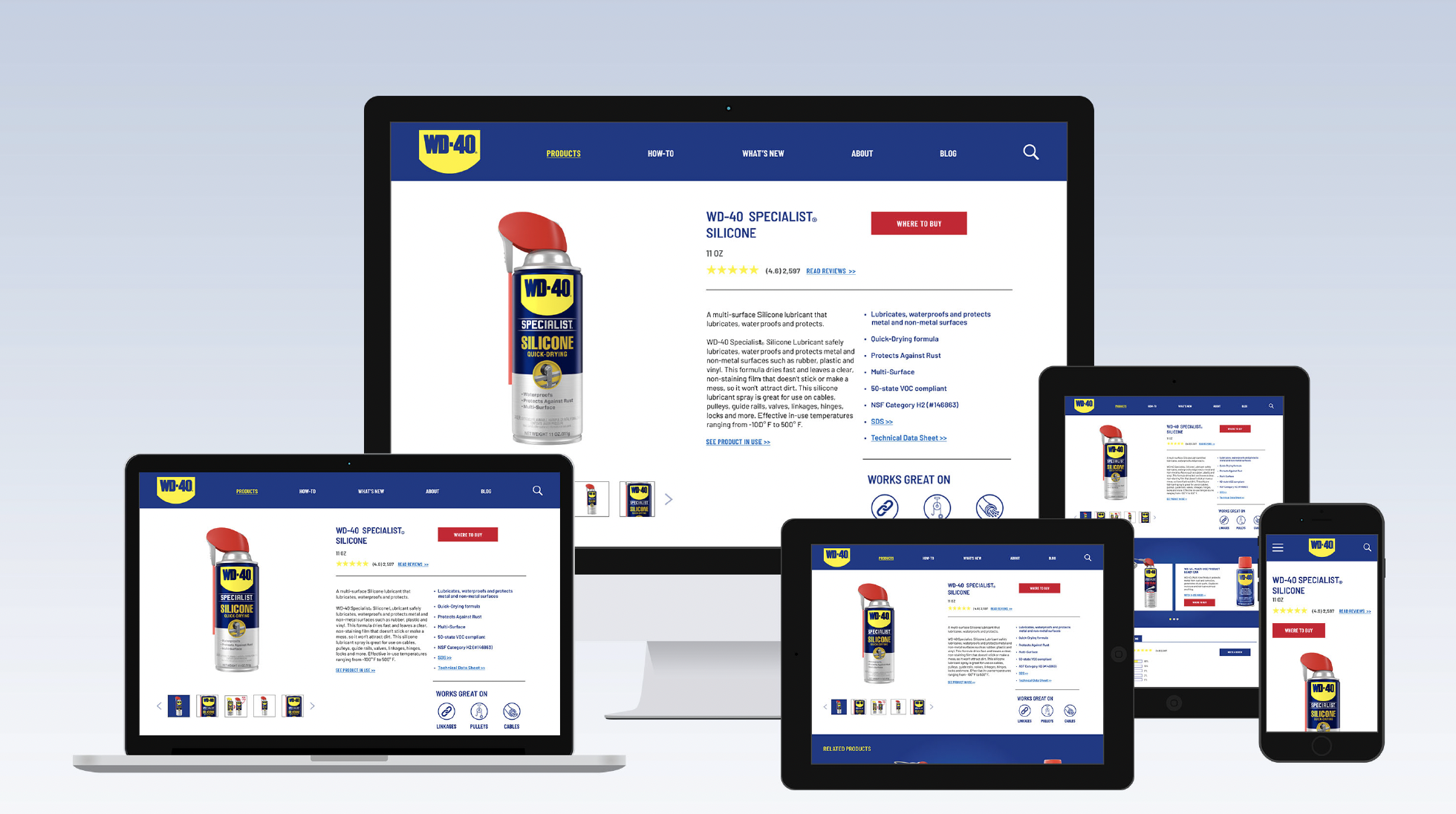
WD-40
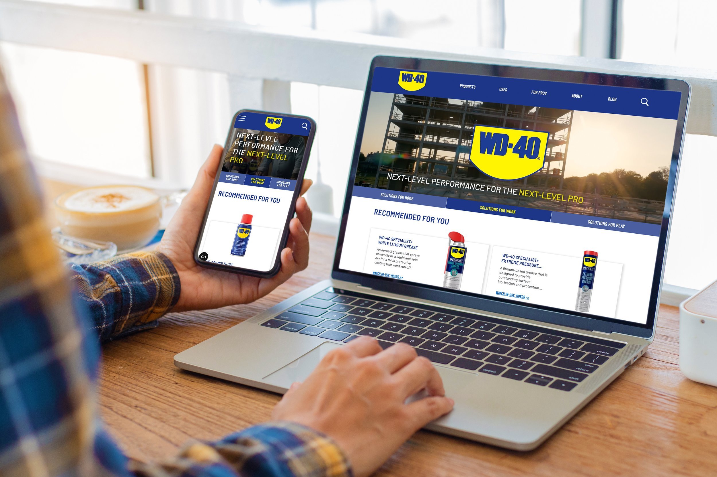
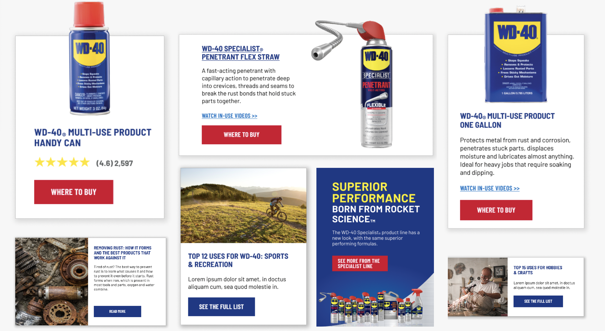
The Project: Consolidate three separate websites: WD-40 Multi-Use, WD-40 Specialist, and WD-40 BIKE into one cohesive digital experience that highlights the full suite of solutions that WD-40 has to offer.
The Challenge: Each product line previously lived on its own website, making it difficult to manage and missing opportunities for cross-promotion. Customers often didn’t realize that WD-40 offers more than just the product they were already familiar with, leading to missed sales.
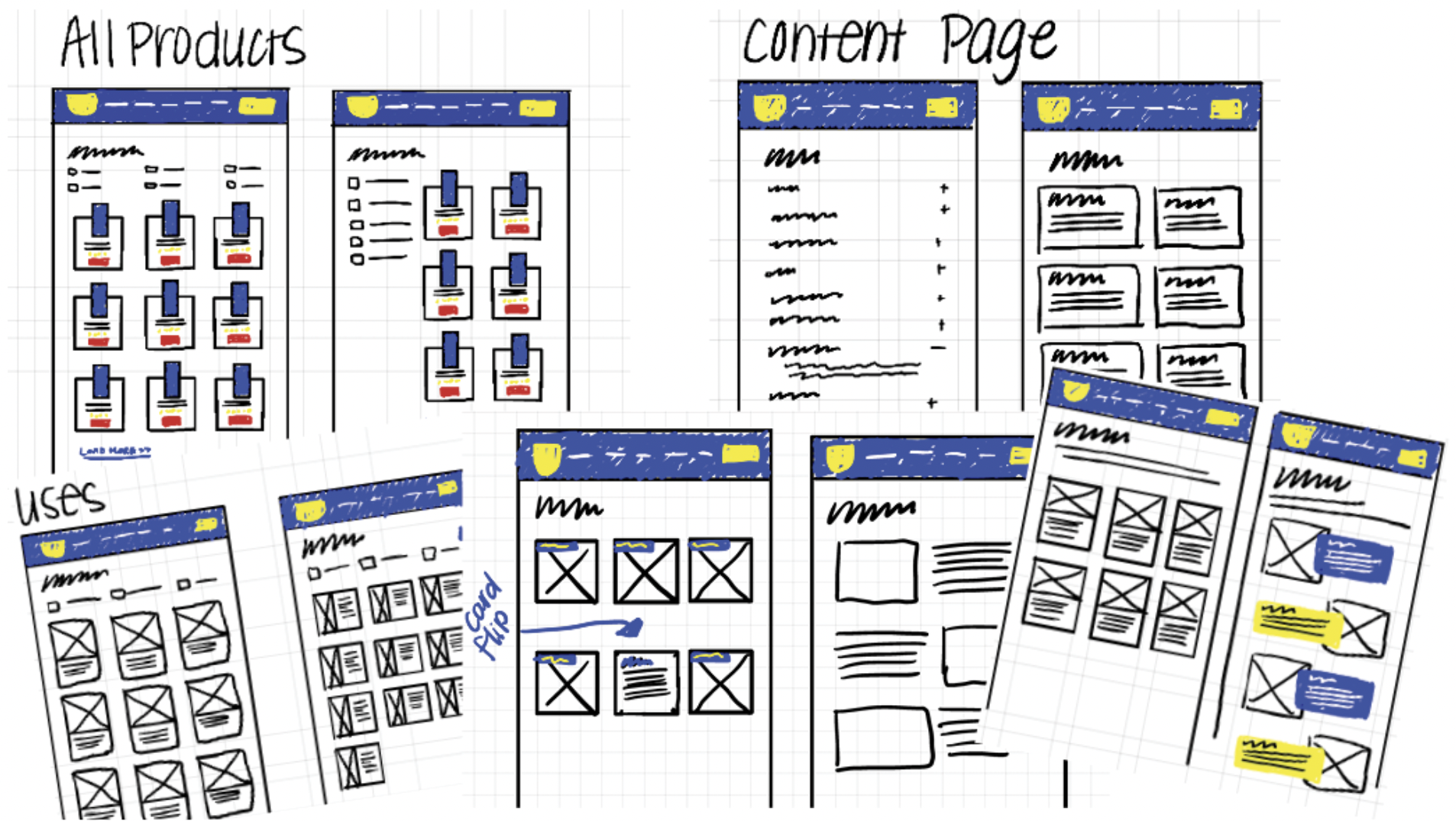
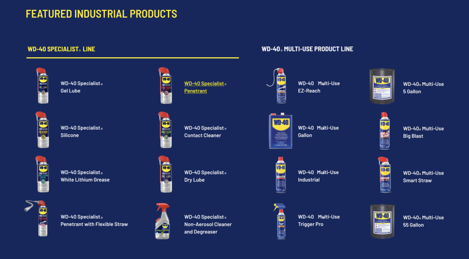
My Approach: Applied the basic principles of behavior-driven design to create an intelligent website that delivered a personalized experience for every visitor. The site dynamically adjusts content based on user behavior and interests. Whether they’re a DIYer, professional mechanic, or cyclist, each user sees relevant products and solutions for their interest.
Impact: The new site not only streamlined management for the client but also delivered strong engagement:
Overall traffic increased by 17% since launch
Returning visits jumped 42%, while new visits grew 13%
Mobile traffic now accounts for 71% of total visits, with a 48% YoY increase
The personalized experience keeps users engaged and helps WD-40 gather valuable behavioral insights to inform future marketing and business decisions.
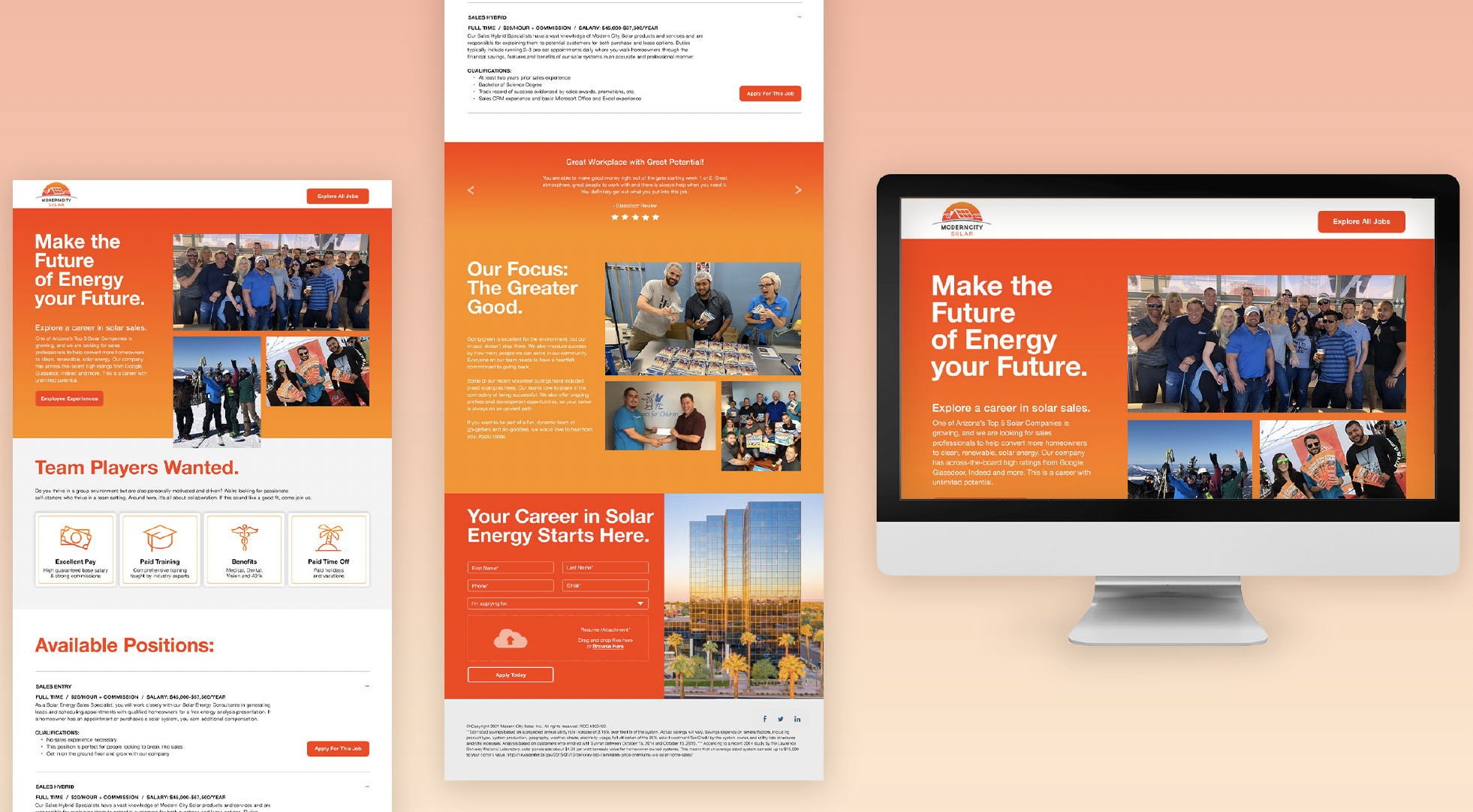
Arizona Game & Fish

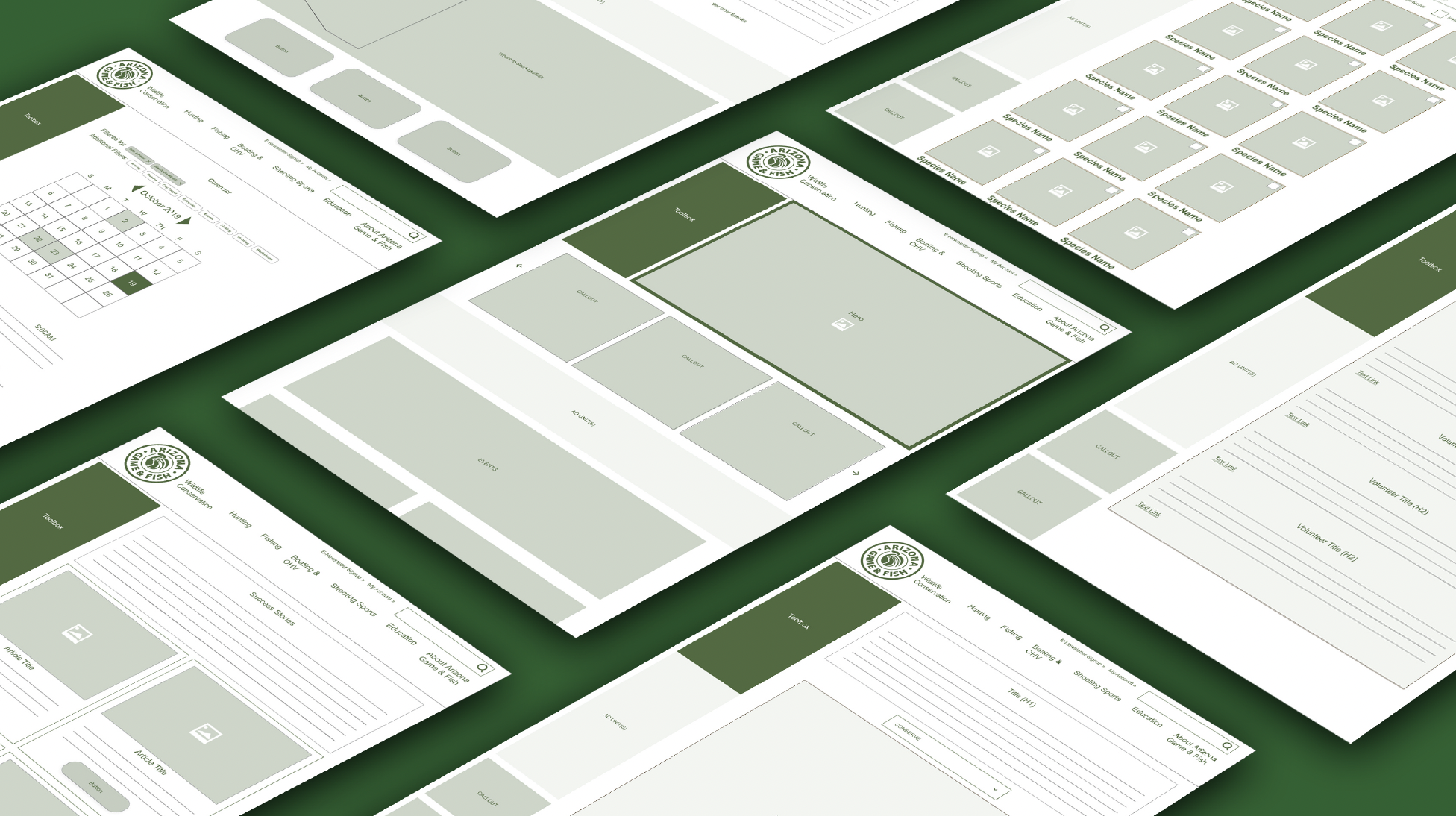
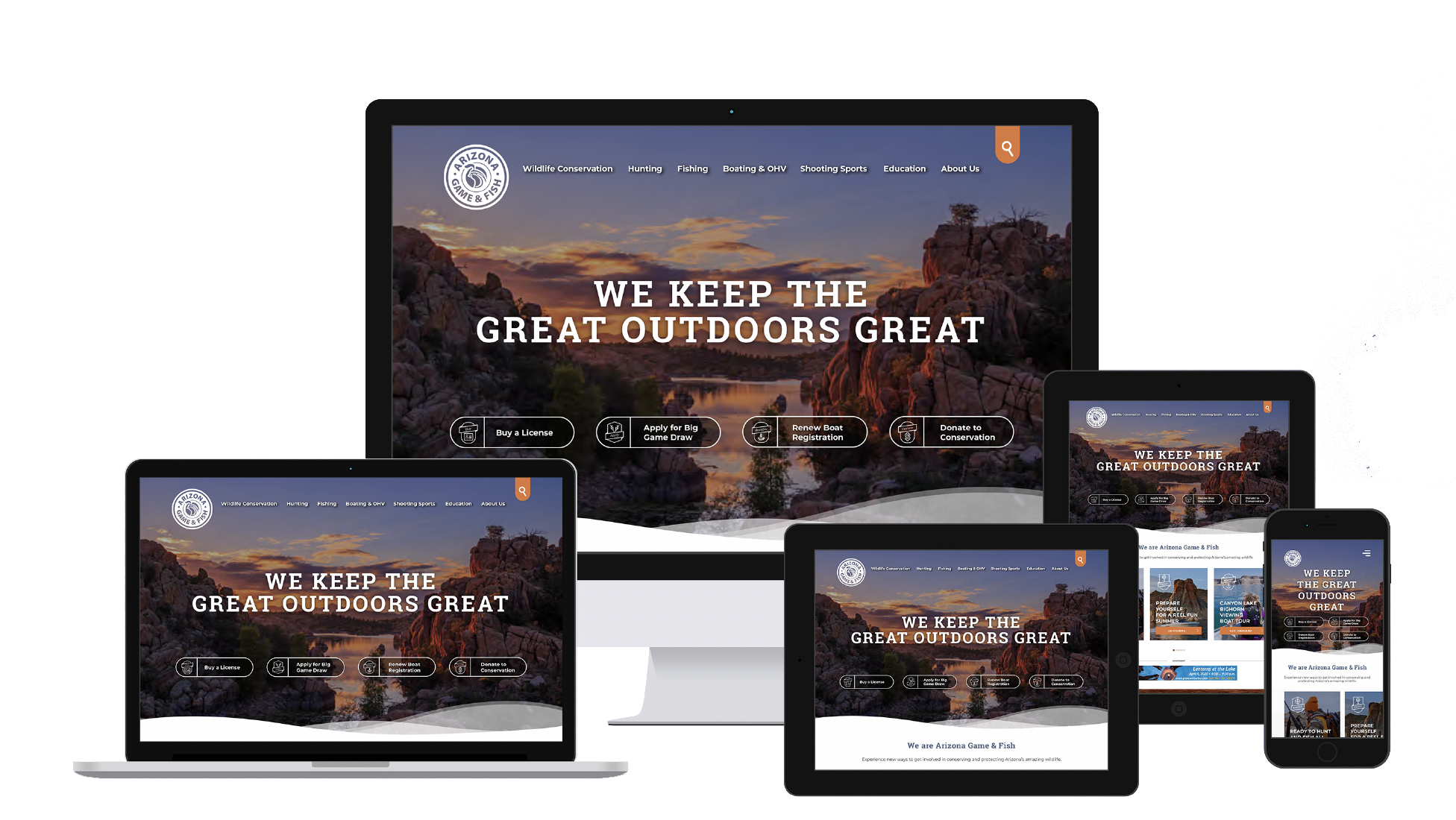
Project: To transform a sprawling 300+ page website into a streamlined, user-friendly experience that’s visually engaging, increase conversions and donations, as well as support ad space. Serve five very different key audiences: hunters, anglers, boat owners, campers and conservationists.
The Challenge: The original website lacked structure. With no design standards in place and multiple admins, the site was overwhelming to manage and ineffective for users to find the information they needed.
My Approach: Conducted a full audit to identify redundant pages and group content into logical categories. I designed wireframes to align stakeholders, then collaborated with copywriters to build mockups tailored to each audience. I developed a modern visual design system, including updated typography, imagery standards, UI cards, and iconography guidelines, ensuring consistency across the site. To support long-term success, I created documentation outlining how and when to create new pages, an approval process, and recommendations for reducing admin access to keep the site manageable and cohesive.
Impact: Created a site that was easier for Arizona Game & Fish to manage as well created a clear journey for the five user groups with clear CTAs which boosted conversions.
Reduced site from 40+ templates to 12 templates and dramatically improved consistency and ease of maintenance.
The simplified navigation, structure and clear user journeys lead to a rise in overall page visits and better access to relevant information, making the site more valuable for both users and the organization.
Ad revenue increased on the website by 4%, and donations to conversation increased by 13%.
San Francisco Federal Credit Union

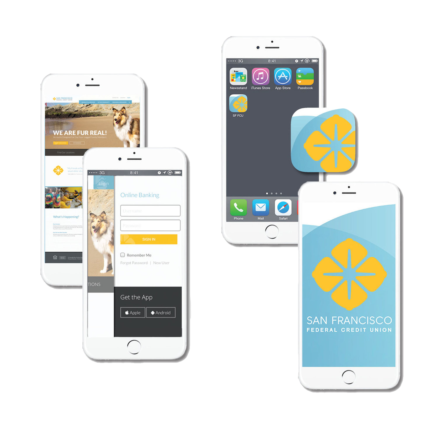
Project: Design a responsive website, an online banking platform, and a mobile banking app, modernizing the credit union’s digital presence and helping members make the shift from in-person to online banking.
The Challenge: Most members weren’t using online banking and were uncertain about changing their banking habits. The average member age was 58 (as of 2015).
My Approach: Collaborated with internal stakeholders to understand business goals and member pain points. After conducting research, I developed wireframes and visual mockups. I worked directly with third-party developers to support implementation, answer UX/UI questions, and provided design assets needed to ensure a smooth build process.
Impact: Within the first 6 months, the new responsive site and mobile app gained 13,000 new users
In-branch support was offered for members needing assistance, but feedback showed most found the new experience intuitive and easy to use.
The modern, user-friendly design helped increase membership and strengthen overall engagement.
This project successfully bridged the gap between digital transformation and user adoption, giving members tools they could trust.
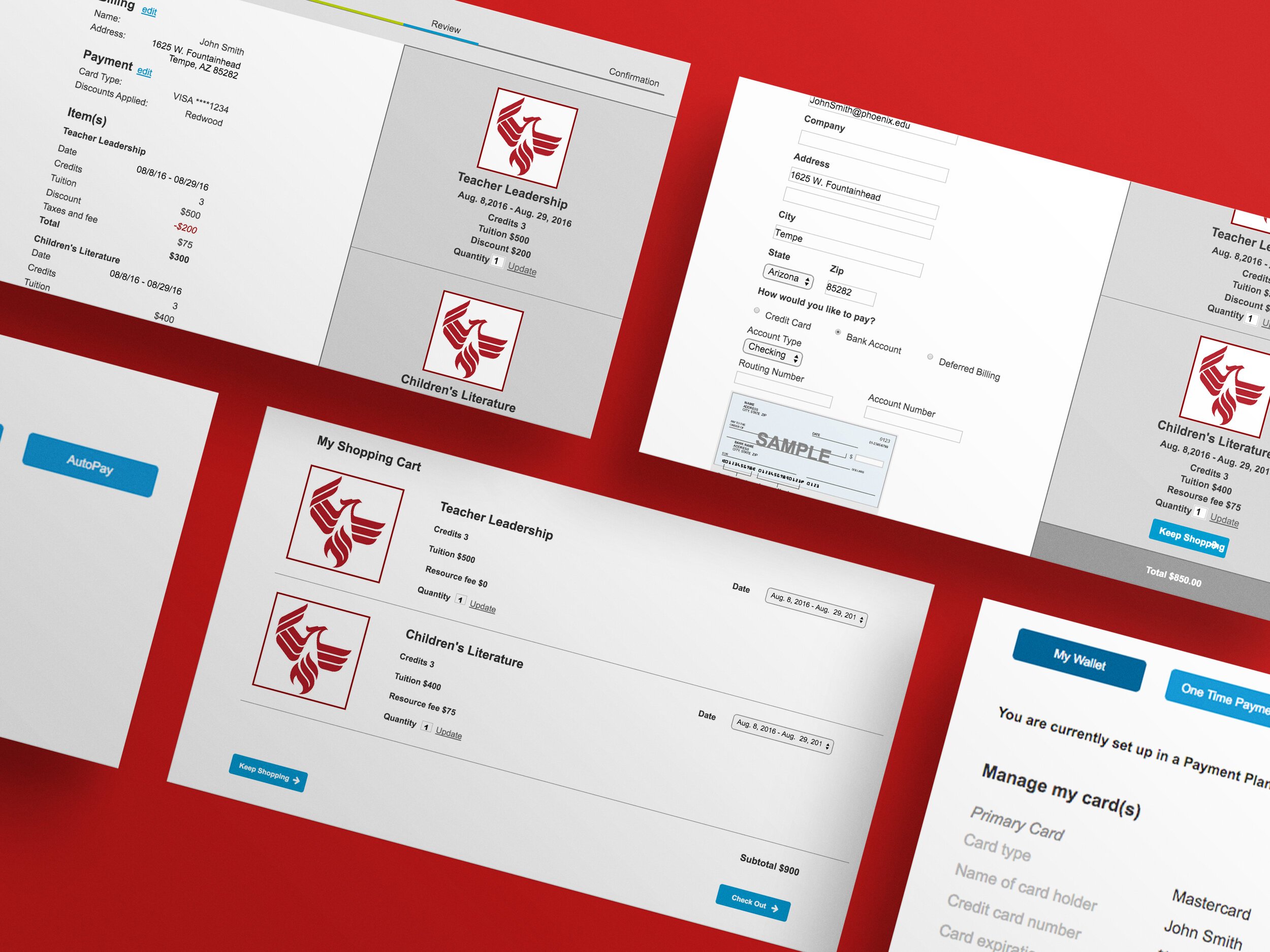
University of Phoenix
The Project:
Shopping Cart: Redesign the course enrollment and textbook purchase flow to make it easier and quicker for students to checkout.
Payment Plan: Develop a flexible “pay-as-you-go” payment system to better support students’ financial needs.
The Challenge
Shopping Cart: The original checkout process had 16 steps, leading to high abandonment rates and frustrated students who often resorted to calling customer support for assistance. The experience lacked clarity, progress indicators, and efficiency.
Payment Plan: There was no structured payment plan for students to pay for their education.
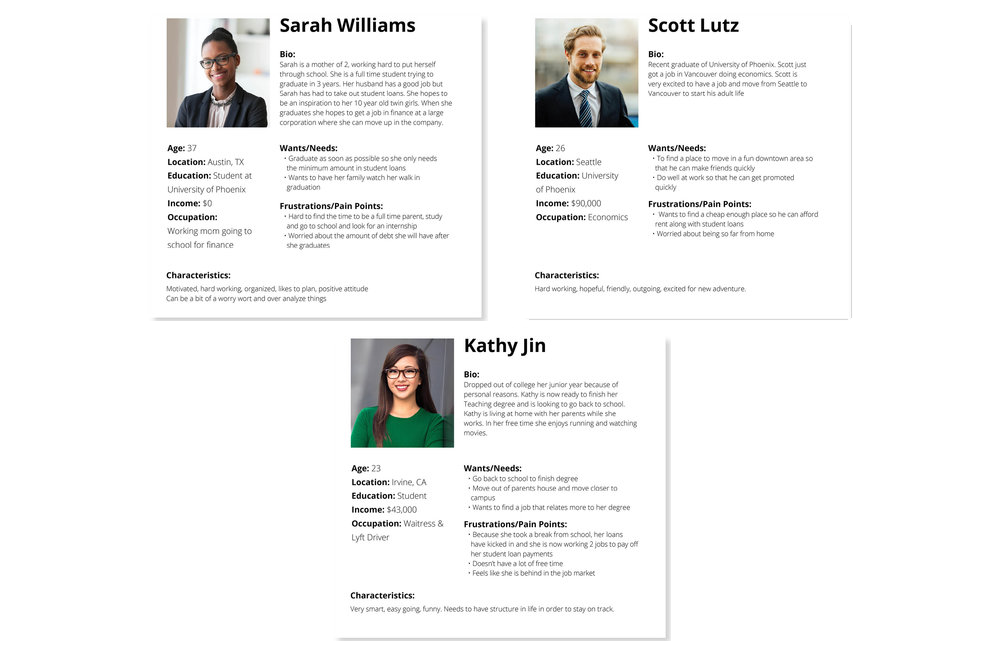
My Approach: Collaborated with an in-house UX research team and worked in agile sprints to move quickly and iteratively. Created wireframes and interactive prototypes for A/B testing. Leveraged the on-site user research lab to conduct in-person testing with paid student participants, gaining valuable insights that directly informed design decisions.
Impact:
Shopping Cart:
Streamlined the checkout process from 16 steps down to 6 steps by reorganizing content hierarchy and minimizing user inputs.
The simplified flow significantly improved user confidence and efficiency.
Test participants even compared the new experience to the ease of checking out on platforms like Target and Amazon.
Payment Plan:
Designed a flexible payment plan system allowing students to pay via credit card, check, or bank account, with added features like autopay and custom due date selection.
Feedback in user tests was positive, and participants noted the clarity and convenience of the new options.

AmeriFirst Financial, Inc.

Project: Redesign AmeriFirst Financial’s Corporate Website to Boost Engagement and Loan Applications
The Challenge: AmeriFirst Financial’s previous website had low traffic, an 87% bounce rate, and poor mobile responsiveness. It lacked SEO optimization, relevant content, and a clear user journey, leading to a poor experience and minimal conversions.
My Approach: I partnered with the executive team to define goals and align on business objectives. From there, I created user profiles, hand-drawn and digital wireframes, and interactive prototypes using Adobe XD and Photoshop to secure buy-in. I also developed UX documentation and requirements for the third-party development team. Throughout the project, I served as the UI/UX designer, project manager, and primary liaison between stakeholders and developers.
Impact:
Added a homepage form, resulting in a 32% increase in customer inquiries
Loan officers saw higher engagement and application rates on individual profile pages
The newly introduced mortgage calculator improved session duration and user interaction, prompting more calls to loan officers
SEO performance increased significantly, and the bounce rate dropped by 26%
The redesign not only improved usability and mobile responsiveness but also created a measurable lift in conversions and overall business performance.