Art Direciton
Great design grabs attention. Art direction makes it unforgettable. I bring concepts to life with a strong visual narrative, unifying style, tone, and message across every touchpoint. Whether it’s a campaign, brand refresh, or digital experience, I pair creativity and strategy to create work that not only looks beautiful but feels intentional, aligned, and impactful.
Arizona Office of Tourism

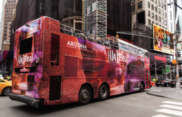
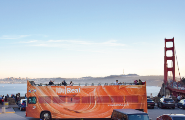
[Un]Real Arizona Campaign
Project: The goal of this campaign was to tap into existing travel motivations and reposition Arizona as a top-of-mind destination beyond just the Grand Canyon. We focused on six key markets: Dallas, New York, Minneapolis, Denver, Chicago, and San Francisco.
The Challenge: The Arizona Office of Tourism found that most people only associated Arizona with the Grand Canyon and extreme summer heat. This limited perception meant that visitors weren’t exploring beyond a single attraction, which led to missed opportunities for economic impact across the state.
My Approach: Because the target cities were all high-traffic, busy cities, the focus was to showcase the relaxing side of Arizona and the natural beauty of the state.
We brought this story to life through stunning, immersive visuals that ran across nearly every major channel; double-decker bus wraps, billboards, solar recycling kiosks, digital newsstands, TV commercials, organic and paid social, interior video displays, and a full takeover of Chicago’s Victory Plaza.
The visuals of this campaign were meant to take the viewers’ breath away by showcasing the unreal landscapes across the state.
Impact:
Visitation from New York alone increased by nearly 2,000 travelers.
Over 400 users of the Visit Arizona app visited the state parks featured in the creative.
For every $1 spent, the campaign generated $200 in revenue for the state.
Maricopa Association of Governments
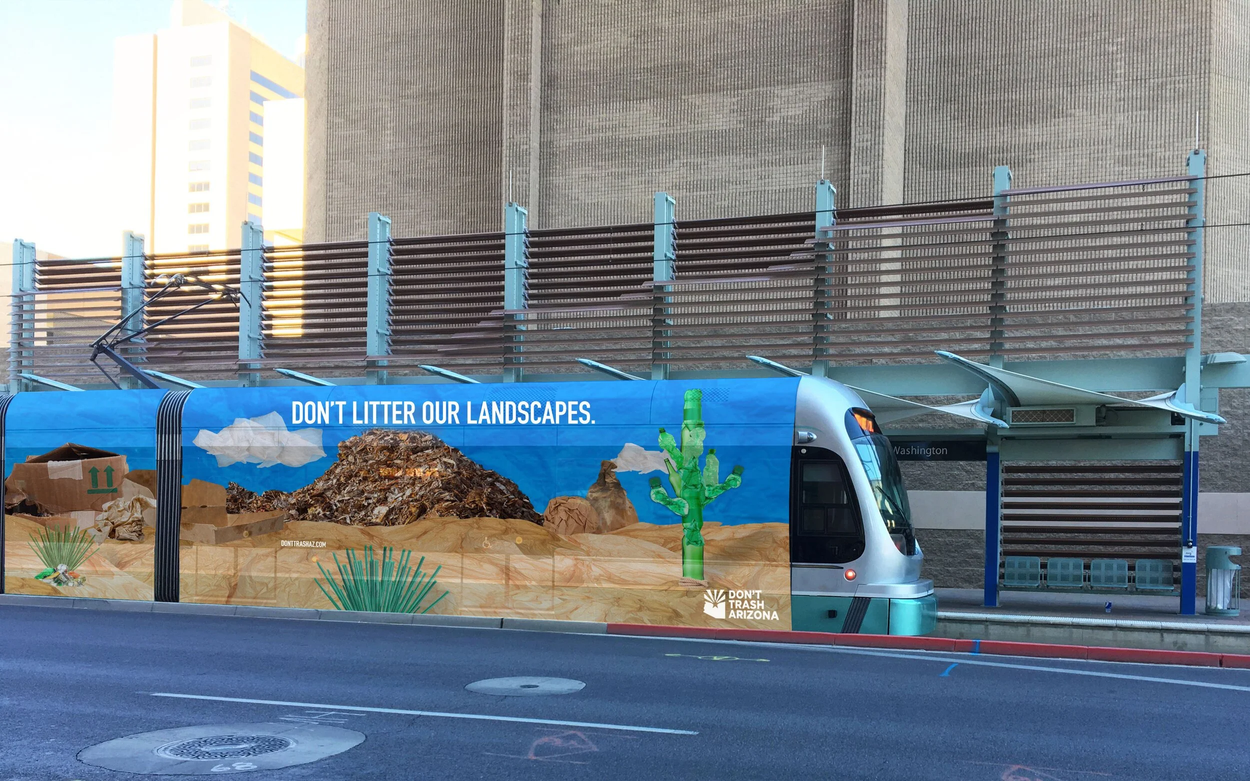
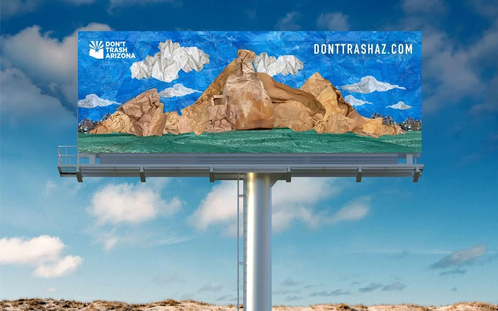
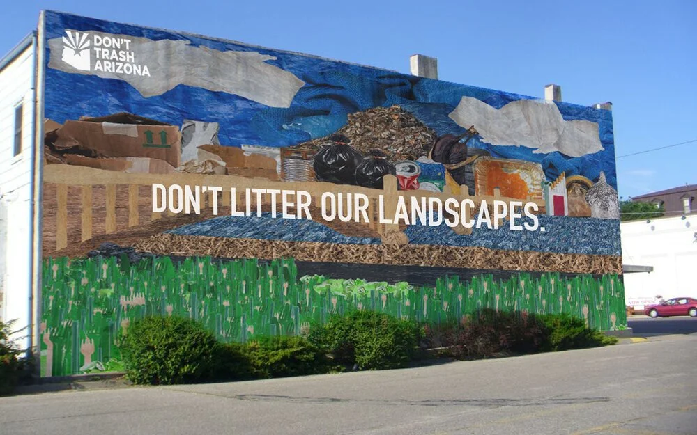
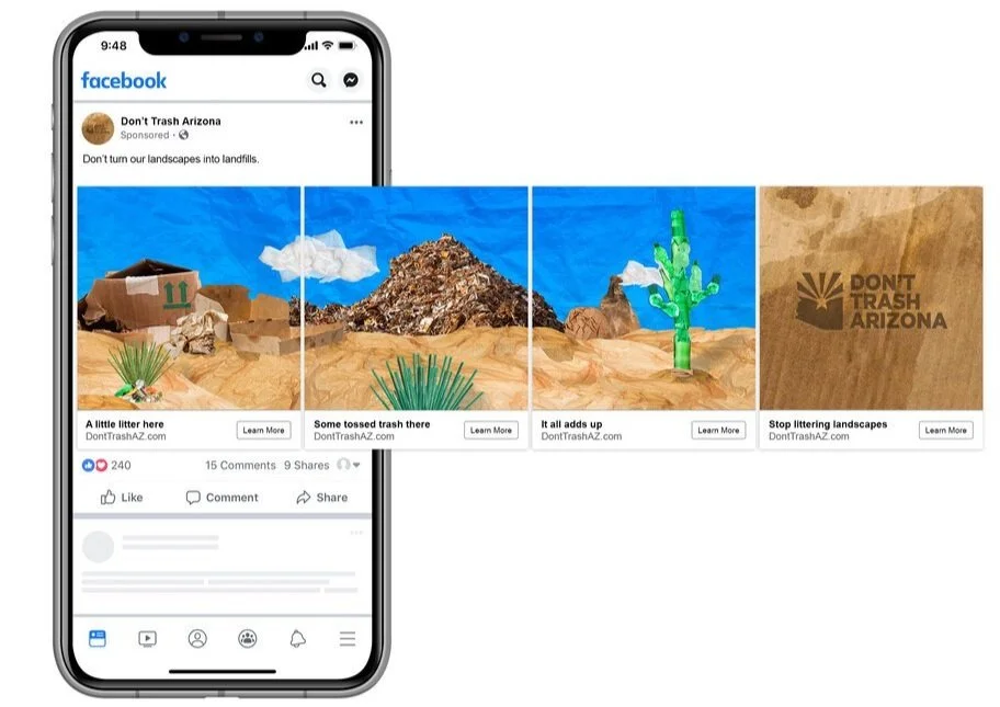
Don’t Litter Our Landscapes Campaign
Project: This campaign aimed to raise awareness about the environmental impact of freeway litter and educate the public on what actually counts as litter. The goal: spark behavior change and reduce trash along Arizona’s highways.
The Challenge: Connect with males aged 18–34, the group most likely to litter on freeways, and shift not just their mindset around what constitutes as littering, but to change their behavior around it as well.
My Approach: Developed a visually interesting outdoor campaign across Maricopa County, complemented by targeted paid social media ads. The concept took iconic local landscapes like Camelback Mountain, Papago Park, and Tempe Town Lake and recreated them entirely out of trash.
From a distance, passersby recognized the familiar scenery. But up close, they realized those views were built from debris, creating a powerful, visual "what if" scenario that made the issue personal and hard to ignore.
Impact:
Nearly 92,000 bags of litter were collected from valley freeways in 2019.
On Facebook, campaign engagement jumped by 115%.
San Francisco Federal Credit Union
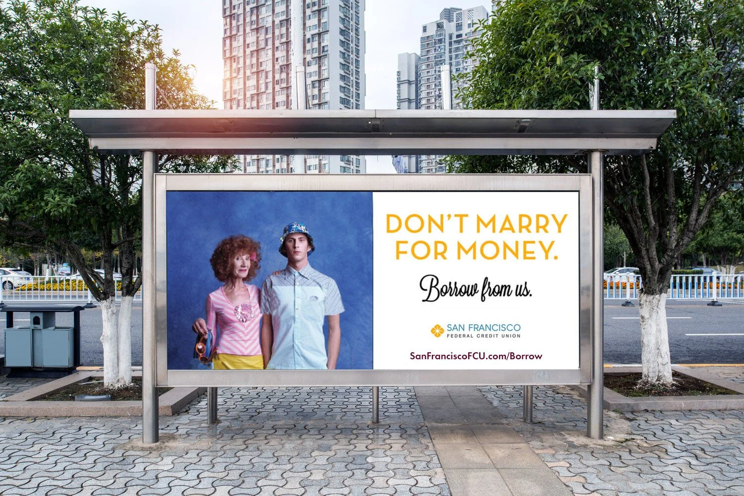
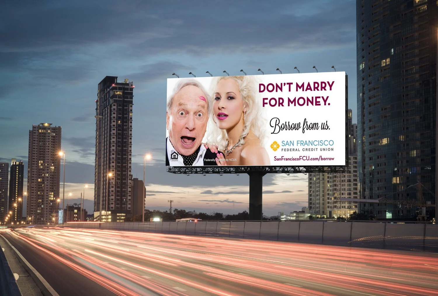
Borrow From Us Campaign
Project: Increase mortgage and personal loan applications while building stronger brand awareness, especially among younger audiences.
The Challenge: Loan applications were falling short of monthly targets, and the credit union struggled with the perception that it wasn’t relevant or appealing to younger consumers.
My Approach: The team started by testing a range of messaging in different San Francisco districts to see what resonated. Once a winning headline emerged, we leaned into a bold, humorous tone to break through the noise and connect with a younger demographic.
The campaign centered around edgy and memorable billboards placed in high-traffic spots like outside restaurants and bars, near major public transit hubs, and directly across from office windows where they couldn’t be missed and conversations were sure to be had.
Impact: The campaign sparked a viral reaction, including an organic Twitter war in which some loved the ads while others hated them.
Loan applications rose by 11%.
The buzz significantly elevated brand awareness.
Our goal of growing brand awareness was achieved on a platform where our target audience was.