
Sometimes the landing page you want to redesign is already doing exactly what it needs to do.
There's a natural instinct as a designer to look at something outdated and immediately start thinking about how to improve it. Better typography, cleaner layouts, stronger branding, and a more consistent experience. Surely all of those things should make a website perform better, right?
Not necessarily.
At Walker Advertising, a legal marketing company connecting consumers with attorneys, some of the highest-converting landing pages were also some of the least visually appealing.
They looked like they hadn't been redesigned in years, because in many cases, they hadn't. They weren't particularly polished, and they didn't always align with the company's broader branding. But they worked, and they worked consistently.
Coming into the project, the thinking was pretty straightforward: these pages were already converting well, so imagine what they could do with better design.
It seemed like an opportunity to take something successful and make it even better.
Except that's not what happened.
Does better landing page design always improve conversions?
Not necessarily. During A/B testing at Walker Advertising, older legal lead-generation landing pages repeatedly outperformed visually redesigned alternatives. The experience demonstrated why landing page performance needs to be evaluated through actual user behavior, lead quality, and business outcomes rather than appearance alone.
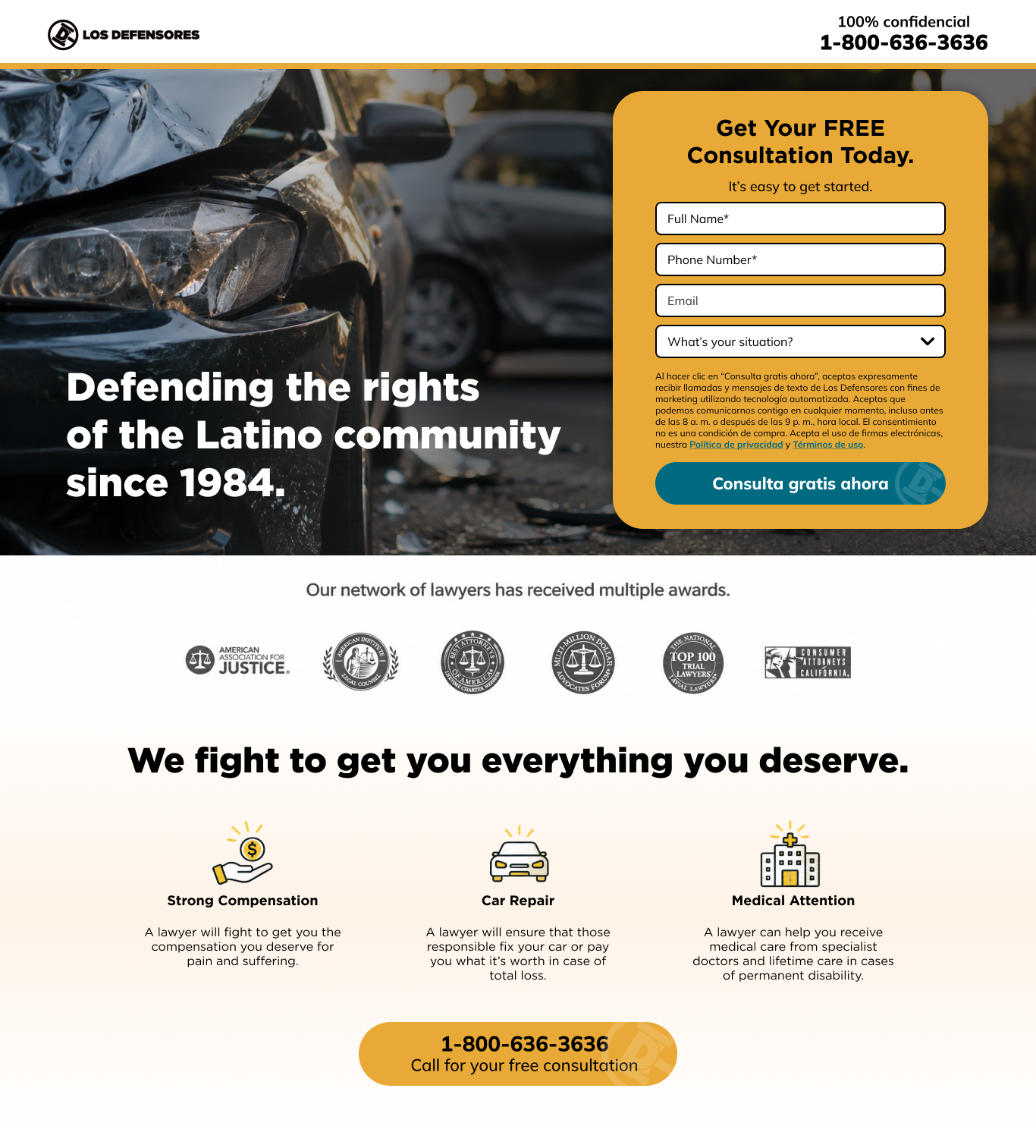
When the Ugly Landing Page Wins
The goal was to modernize the existing landing pages without losing what made them successful. That meant creating cleaner designs, improving the visual hierarchy, and making the experience feel more connected to the advertisements bringing people there.
If someone clicked on an ad with a particular visual style, it made sense that the landing page should feel like a natural continuation of that experience.
From a design perspective, the updates felt like improvements. But when we put them to the test, the older pages kept winning.
And not just once.
We tested different approaches to understand what was happening. Sometimes we kept the same basic structure and updated only the visual design. Other times, we adjusted the hierarchy or experimented with different messaging.
The results continued to favor the original pages.
It was surprising, especially coming into the project with the belief that better visual design would help already successful pages convert even more.
The experience challenged that assumption in a big way.
So Why Were the Older Pages Performing Better?
That's the question we kept coming back to, and the reality is that we never had a definitive answer.
There were a few theories.
One was the nature of the personal injury industry itself. People arriving on these pages were often looking for legal help after an accident. They weren't necessarily browsing or comparing brands the way someone might when shopping for a product.
They may have been stressed, overwhelmed, or simply looking for someone to help them.
In that situation, maybe a straightforward page with an obvious form was all they needed.
Another possibility was familiarity. Legal advertising has a certain look, and perhaps those older landing pages matched what visitors expected to see.
There was also the question of trust. Personal injury advertising can carry skepticism, and it's possible that different visual treatments influenced how people perceived the pages.
But those were theories, not findings we could prove.
What we did know was that the redesigned pages weren't delivering the improvements we'd expected.
And that was an important lesson: just because something looks better doesn't mean it works better for the audience using it.

The Form Tests Were Just as Interesting
The landing pages weren't the only things being tested. We also spent a lot of time experimenting with forms.
Forms are a huge part of lead generation. They're often the point where someone decides whether they're willing to take the next step, so even small changes can matter.
One of the more surprising findings was that multi-step forms outperformed single-page forms for certain traffic sources.
At first, that might seem backward. A multi-step form requires someone to click through several screens rather than filling everything out in one place.
Wouldn't fewer steps be easier?
Not always.
Breaking a form into smaller sections may make it feel less overwhelming. Instead of seeing a long list of questions, visitors can focus on answering a few at a time.
That could help explain the results, although we didn't conduct the behavioral research needed to confirm exactly why those forms performed better.
What made it even more interesting was that results varied depending on where visitors came from.
Someone arriving through paid search wasn't necessarily behaving the same way as someone arriving through a social media campaign on Meta or TikTok.
The lesson wasn't that multi-step forms are always better. It was that the right experience depends on the audience, the context, and how someone arrives at the page.
One of the more surprising findings was that multi-step forms outperformed single-page forms for certain traffic sources. Illustrative comparison of single-page and multi-step intake forms. During testing, multi-step forms performed better for certain acquisition channels, reinforcing the importance of testing different experiences for different audiences.
A Conversion Isn't Always a Qualified Lead
Another important part of the work was understanding what success actually meant.
At Walker, generating leads was the business. But getting someone to fill out a form was only part of the equation.
The quality of those leads mattered just as much, if not more.
A landing page could generate a higher volume of submissions, but that didn't necessarily mean it was generating more qualified leads.
We looked at performance through several lenses, including overall leads, qualified leads, and advertising costs.
Cost per click (CPC) mattered because paid traffic was a significant investment. Cost per lead (CPL) helped put the economics of lead generation into perspective. And qualified leads were especially important because the goal was ultimately to connect people with attorneys who could potentially help them.
It wasn't enough to make a form easier to complete if the people completing it weren't the right audience.
This is where design and business strategy really start to overlap.
A designer might look at a higher conversion rate and consider the test successful. But if the business isn't getting better outcomes, is it really an improvement?
Not necessarily.
What This Changed About the Approach to Design
The biggest takeaway wasn't that attractive websites don't work. They absolutely can, and there are plenty of situations where stronger branding, clearer hierarchy, and a more cohesive experience make a meaningful difference.
It was realizing that those improvements shouldn't be treated as guarantees.
Coming into the project, the expectation was that better visual design would make an already successful experience even more successful.
The testing challenged that thinking.
It reinforced the importance of asking questions before jumping into solutions, understanding what a business is actually trying to accomplish, and being willing to change direction when the data tells a different story.
Sometimes that means a complete redesign. Sometimes it means testing one small element at a time.
And sometimes it means leaving something alone, even when every design instinct says it could look better.
Before You Redesign, Understand What's Working
It's easy to look at an outdated website and assume it needs to be replaced. And sometimes it does.
But appearance alone doesn't tell you whether a website is doing its job.
Before committing to a redesign, it's worth understanding a few things:
What's already performing well?
Where are visitors dropping off or getting confused?
Are you measuring form submissions or actual qualified leads?
Does performance change depending on where traffic comes from?
Can smaller changes improve the experience without rebuilding everything?
These questions don't replace good design. They help make sure design decisions are solving the right problems.
A website needs to work for both the people using it and the business behind it. Getting that balance right requires more than good visual instincts.
It requires curiosity, testing, and a willingness to be wrong.
Sometimes the Data Wins, Even When the Design Doesn't
Looking back, those outdated landing pages taught a valuable lesson.
Design isn't about making everything prettier. It's about making things work better.
And while visual design is an important part of that process, it isn't the only factor influencing how people behave.
The experience at Walker reinforced an approach that continues to shape MezCreative's work today: understand the audience, question assumptions, test where possible, and make decisions based on what the evidence actually shows.
Because sometimes the best-looking option isn't the best-performing one.
And sometimes the ugly landing page wins.
About MezCreative
MezCreative helps businesses build stronger brands, websites, and digital experiences through thoughtful design and practical problem-solving. With 15+ years of experience across visual design, UX, and digital marketing, the focus is on creating work that not only looks good but supports real business goals.
