
UX/UI DESIGN | UX RESEARCH | A/B TESTING | EDUCATIONDesigning a Modern Checkout Experience Through User Testing
The Project
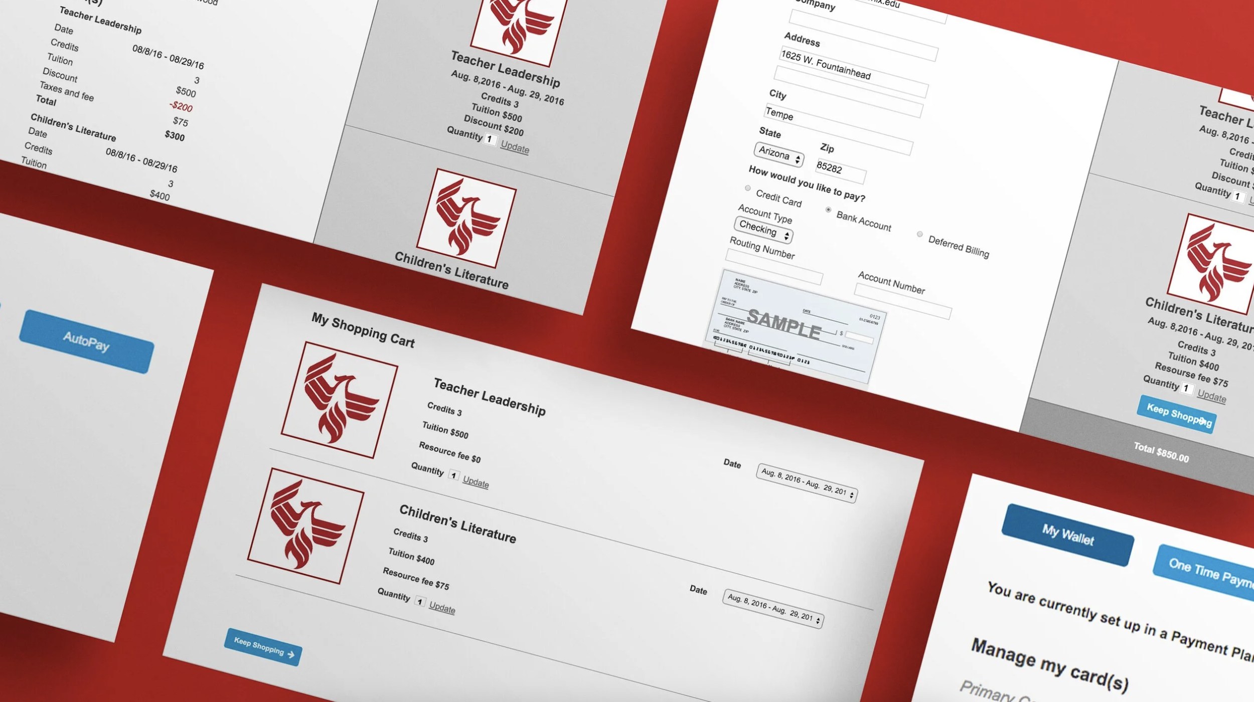
Redesign the online checkout experience that allowed students to enroll in classes and purchase required books and course materials in one seamless transaction. The goal was to create a checkout process that felt as intuitive and familiar as leading e-commerce experiences, reducing friction during one of the final steps of enrollment.
The Challenge
The existing checkout process required students to navigate a confusing 16-step flow to register for classes and complete their purchase of required course materials.
The lengthy experience lacked clear progress indicators, presented too much information at once, and required unnecessary user input, causing students to lose confidence before completing enrollment. Many abandoned the process entirely or contacted customer support for assistance.
Rather than simply reducing the number of screens, the challenge was to understand why students struggled and redesign the experience around how people naturally expect modern online checkout experiences to work.
The Research
Working alongside the University's in-house UX research team, wireframes and interactive prototypes were designed and evaluated through moderated usability studies in the University's dedicated research lab.
Prospective and current students were invited into the lab to complete realistic enrollment and checkout tasks while interacting with our prototypes. Using eye-tracking technology, live observation, and participant feedback, a detailed understanding of how students moved through the experience, where they focused their attention, and where confusion or hesitation occurred.
From the observation room, I collaborated closely with researchers and stakeholders throughout each session. As participants worked through the prototypes, I partnered with the moderator to explore unexpected behaviors, ask follow-up questions, and better understand the reasoning behind participants' decisions. These conversations often uncovered insights that wouldn't have been apparent through analytics alone.
Each round of research informed the next design iteration, allowing the experience to evolve through continuous testing and refinement before development
The Solution
Research consistently showed that students expected the enrollment checkout experience to work much like the online shopping experiences they used every day.
Using these insights, I redesigned the checkout flow by simplifying the information architecture, reducing unnecessary inputs, introducing clear progress indicators, and organizing content into a more predictable sequence.
The final experience streamlined the checkout process from 16 steps to just 6, making it easier for students to enroll in classes and purchase their required course materials with greater confidence and less friction.
The Impact
✳︎
The Impact
✳︎
The Impact
✳︎
The Impact
✳︎
The Impact
The Impact ✳︎ The Impact ✳︎ The Impact ✳︎ The Impact ✳︎ The Impact
6 steps
streamlined from a 16-step checkout
Enrollment
streamlined from a 16-step checkout
Flexible
payment plans with AutoPay and custom due dates
Confidence
increased through user-tested design